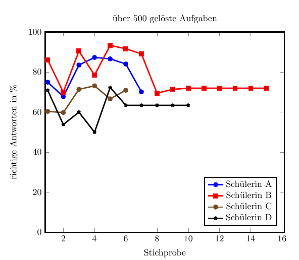
irgendwie habe ich Probleme mit pgfplots, weil die Diagramme falsch sind.
\documentclass[10pt,a4paper]{article}
\usepackage[latin1]{inputenc}
\usepackage{amsmath}
\usepackage{amsfonts}
\usepackage{amssymb}
\usepackage{graphicx}
\usepackage{pgfplots}
\begin{document}
	\begin{tikzpicture}
	\begin{axis}[
	%width=0.9\textwidth,height=0.9\textheight,
	width=0.9\textwidth,
	title={über 500 gelöste Aufgaben},
	%xtick={1,2,3,4,5,6,7,8,9},
	%	x tick label style={/pgf/number format/1000 sep=},
	xlabel={Stichprobe},
	ylabel={richtige Antworten in \%},
	ymin=0, ymax=100, xmin=1, xmax=16,enlarge x limits=0.01,legend entries={Schülerin A, Schülerin B, Schülerin C, Schülerin D, Schülerin E}, legend pos=south east, line width =1.5pt]

	\addplot table[x=Tag, restrict x to domain=0:7,  y=A] {alleStatsf.csv};
	\addplot table[x=Tag,restrict x to domain=0:15, y=B] {alleStatsf.csv};
	\addplot table[x=Tag, restrict x to domain=0:6,y=C] {alleStatsf.csv};
	\addplot table[x=Tag, restrict x to domain=0:10,y=D] {alleStatsf.csv};
	\end{axis}
	\end{tikzpicture}
\end{document}
Vor allem gehts um Schülerin B...
Inhalt der Spalte:
86.1789
70
90.5405
78.5714
93.3649
91.7197
89.1566
92.5926
91.0345
92.2222
84.6154
76.9231
90.625
91.2281
98.1818